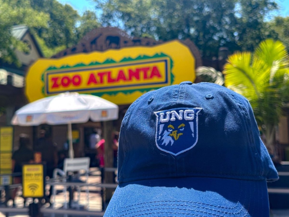
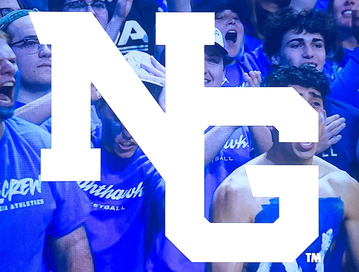
In July, the University of North Georgia Athletics unveiled a new logo design across their social media platforms, sparking reposts and comments among students and athletes.
The new logo replaces the previous UNG design with a simplified NG, featuring the N slightly above the G. Brendan Schabath, Director of Athletic Communications says this design choice symbolizes UNG’s pride in being a leading collegiate institution in North Georgia.
“Always having lived in Georgia, I grew up recognizing the old logo so getting to represent it was a really unique experience. Once I became a UNG athlete, I realized a lot of responsibility came with wearing it since my program and all of the others built it up over time as a symbol of excellence in the conference,” said Carly Fahey, senior women’s basketball player.
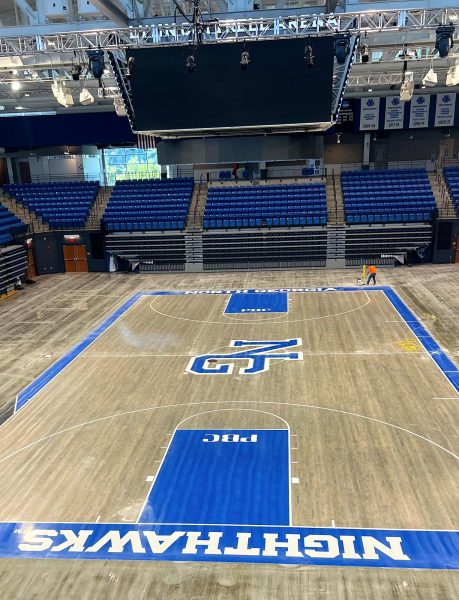
Despite no significant negative feedback on the old logo, Schabath said, “The logo change serves as an opportunity for UNG to standardize its public brand and become a staple in the community and in the NCAA with a modern, recognizable, and unique logo.”
Anna Grace Worley, a graduate assistant in athletics, said, “I believe the new logo will help standardize the brand of North Georgia athletics. I personally love the new logo. The more I see it, the more I fall in love with it.”
UNG also introduced a new tagline with the logo: “Renewed Appearance. Same Mission.” Schabath added, “While our logo has been refreshed, we are still striving every day to win championships and be the best NCAA Division II athletic department in the country.”
“At first I did not know how I felt about the logo change. Although, after seeing it on shirts and on different pieces of gear, the new logo quickly grew on me. I think the new and clean look of this logo brings us to a different level as UNG Athletics moves to dominate Division II going forward,” said Max Garnett, junior men’s soccer player.

