


The Visual Arts Department at the University of North Georgia revealed a new student-designed logo for the nonprofit during a celebration hosted at the Gainesville campus.
The junior and senior graphic design students spent four weeks during the winter semester working with the organization to develop a new approach to its brand and logo.
Tiffany Joy Prater, the associate professor who led the internship, said, “Over the past four weeks, technically last semester, our graphic design students translated BDC values into a thoughtful, accessible brand system demonstrating how design can serve as a tool for advocacy, clarity and care.”
“Together, we uplift the community through design.” — Tiffany Joy Prater, Associate Professor
Prater said there is a “powerful role of visual identity in community advocacy.”
Prater introduced BDC as “rooted in clarity, empathy and communication for individuals and families impacted by dementia.”
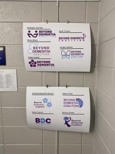
The organization educates and trains families across Georgia about dementia. It states, “Beyond Dementia Coalition seeks to reduce stigma and inspire people through awareness and education to recognize, engage, assist, and ultimately embrace people living with dementia as valued and beloved members of the community.” The website states more than 1,000 Georgians have been supported through its programs.
Prater worked alongside her intern, Sebastian Martinez. Martinez said juniors and seniors were “split into groups based on [their] personal strengths as designers.” When assigned, they met with the BDC board.
To focus on students’ individual skills and strengths, three groups were formed with a different design focus. Nathalie Garrido, Rosa Ramos and Sofia Cancel served as the team leaders.
Garrido led the human-centered design group. Ramos headed the dynamic design focus group, and Cancel led the minimalist design group.
Each student designed a separate logo based on their group’s design focus. “In round one they each presented two options to choose from,” Martinez said. “The board would then be able to pick their favorite out of them and then also offer feedback…and get it to fit the mission and their branding identity goals,”
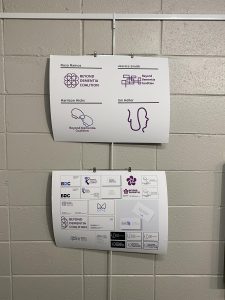
The human-centered group avoided brain iconography and wanted to incorporate flowers and butterflies.
The dynamic design group focused on creating visuals with overlapping shapes and lines.
The minimalist design group used Arial as the primary font, with heart, puzzle and brain iconography.
Throughout the process, each team met with the board of BDC to better understand what they were looking for in a logo. The board asked them all to incorporate blues and use softer fonts.
“It’s like pulling your hair out trying to find these things.” Martinez said. “It’s not always super smooth.”
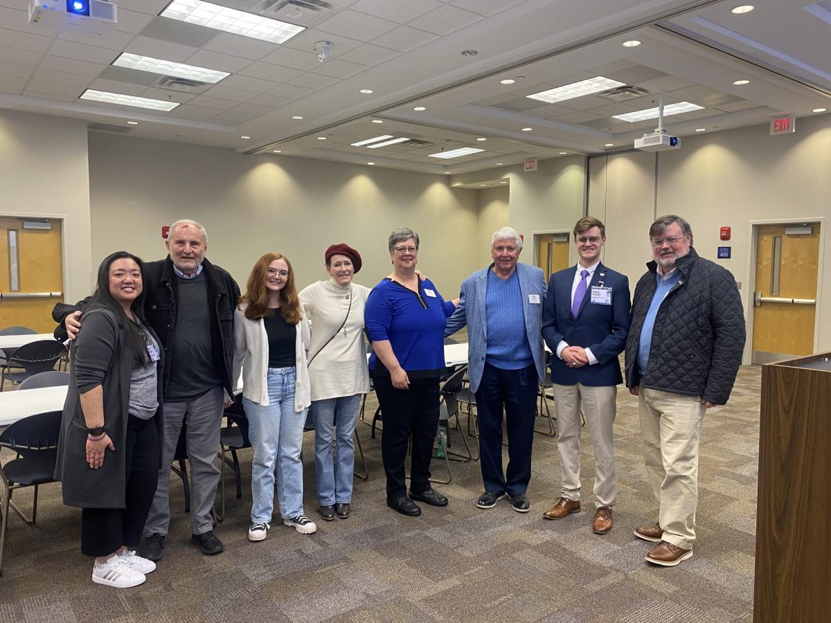
Bill Wittel, CEO and board chairman, and Stacey Childers, operations and project director, revealed the final logo to the students on Jan. 13, 2025.
“I can’t tell you how much we appreciate all the work you have put into your designs,” Wittel said. “All submissions were fantastic, and we could’ve gone with any one of them.”
Wittel said he was the only one on the board who saw the work happening in the classroom. He said, “We didn’t educate you; you had to go and learn. But this isn’t some commercial design. You had to put your heart in it and your feelings and that learning process on your own is valuable.”
Childers said, “This was such a fun process for us, and it was great to work with all the students, and we really liked a number of them, so it was difficult to, as Bill said, funnel it down to the final selection.”
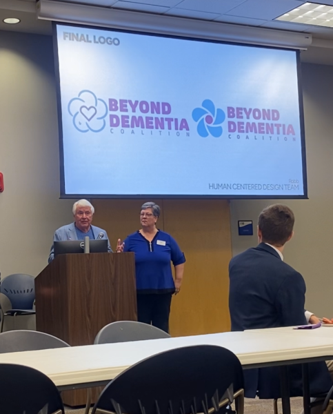
Wittel and Childers said two logos split the board’s vote. Childers said, “There were eleven people that voted…we got down, and it was five to five when we got the last vote.”
The two designs were by student Robb Daniel and alumna Emma Cheek. Ultimately, Daniel’s logo was the one revealed at the end as the new face of BDC.